Many companies strive for data-driven decision making. That requires being able to analyze large amounts of data, understand that data, and relay it to others.
One prominent example that demonstrates the consequences of missing the mark on data-driven decisions is the space shuttle challenger disaster that killed all seven crew members.
The disaster was caused by an O-ring failure and it has been noted that the failure could have been avoided if all the data available was adequately analyzed prior to the shuttle launch. You can read more about this topic in the published case study “Risk Analysis of the Space Shuttle: Pre-Challenger Prediction of Failure” by Dalal et al. (1989).
Accurately visualizing large data sets is one aspect that can contribute to our ability to comprehend and analyze data adequately. In fact, Edward Tufte (a prominent American statistician) teaches an entire seminar on data visualization.
In drug development, there are many good examples of plots that are widely utilized to visualize data. This includes waterfall plots, spider plots, and swimmer plots to name a few examples. However, there are some other types of plots not broadly utilized in drug development. One such example is radar plots (or radar charts) and below I share an example of how it can be utilized in the context of drug development.
A radar chart allows you to display multivariate data in a relatively simple format. I’ve seen many instances of radar charts used to present sports data (e.g. comparing statistics for two players such as this new player comparison on Twitter).
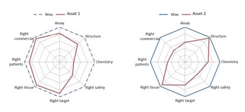
Portfolio prioritization is one instance where our industry can utilize radar plots. Consider trying to evaluate multiple assets in order to make a decision on which assets should be included in your organization’s portfolio. Each asset is typically evaluated across multiple criteria (e.g. unmet need, commercial opportunity, etc.) and it can be difficult to visualize all the criteria on a single plot.
A radar plot can be the perfect tool for this exercise by doing the following:
- Assign a scoring scheme for each evaluation criteria
- Evaluate each asset across the criteria and assign a score
- Map all the scores on a single radar plot (with the ability to overlay multiple assets in a single plot).
Below is an example of the output radar chart for a portfolio prioritization exercise. Notice how it allows you to compare various assets at a glance.
Have you ever used a radar plot to visualize data in drug and/or medical device development setting? If so, feel free to share it in the comments section. I would love to hear about your experience!